Homepage Design: 5 must-have elements
Your website’s homepage serves as the virtual front door to your online world, and it’s essential to make a great first impression. In this post, we’ll explore homepage design, specifically the five key elements that your website homepage must have to captivate visitors and drive them to explore further.
This post may contain affiliate links. Please see my disclosure page for more info
Should you DIY your website or hire a web designer?
Ready for a website but not sure if you should DIY it with a template or hire a designer?
Take my quiz to discover the best option for you. I’ll ask a few simple questions & then provide you with a recommendation on what is your best fit.
1. Clear, concise statement
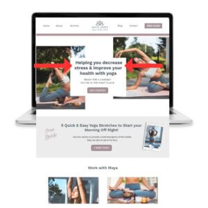
The first thing that you must include on your homepage design is a clear, concise statement above the fold (meaning what your visitor sees before needing to scroll down) that communicates exactly who you help and how you help them.
This will immediately let them know if they are in the right place
Each of my website templates includes a space for plugging in your statement above the fold so that you can quickly and easily communicate this.
2. Powerful call-to-action button
Every effective homepage design should include a clear call-to-action (CTA).
A CTA is a prompt that encourages visitors to take a specific action, such as making a purchase, opting in to a freebie, or contacting you for more information.
Ensure that your CTA stands out and is easily accessible on your homepage by using an attention-grabbing button in a bold color with clear, compelling text to guide visitors toward the desired action.
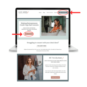
I recommend that your CTA be above the fold. Two great places for one are in your navigation bar and right below your statement as seen in the Lily Anne Showit website template below.
3. An email opt-in form
A call-to-action button could send a visitor to an email opt-in form, but if it doesn’t, this is a really important piece of your homepage design.
An email list is essential for your business to grow and make money!
Why?
1. You Own It
An email list is something you have full control over.
You do not own any of the social media platforms or your followers on those accounts. That means if Facebook or Instagram decides to shut down your account one day, you lose all of your followers. All your years of hard work building up a following disappears.
With an email list, no one else gets to decide how or when you communicate with your audience. You have full control.
2. Having an email list allows you to build a connection and a relationship with your audience
Through your initial emails, often referred to as a welcome series, your subscribers are able to learn more about you and discover how you can help them with their pain points. They also have the ability to directly reply to you and ask questions.
These conversations help you to build a strong relationship with your audience. Your subscribers will be your most loyal fans.
3. An email list increases traffic and revenue for your business
When you send an email to your list and include a link to your newest blog post, podcast, video, etc. a percentage of people will click on the link and go check it out. That means that with a press of the send button, you can instantly get traffic to your site.
If you consistently offer value to your list, you will have a warm audience that is ready to buy when you have an affiliate product to offer or a service or product of your own to share.
BUT the days of creating a small form on the side of your website that says “Sign up for my newsletter” are over.
People’s inboxes are flooded with info these days and nobody has time for another newsletter!
You need to provide your ideal person something of true value that is worth them handing over their email address.
Once they are on your list, you need to nurture the relationship to help them build a know, like, and trust factor with you.
People do business with people they know.
An email list helps you convert random visitors into conscious subscribers, allows you to build a connection with your audience on a more intimate level, and helps you sell your products/services with confidence down the line.

4. Clean Design & Concise Copy
Clean design on a website refers to a visually appealing and clutter-free layout that enhances the user experience. It emphasizes simplicity, minimalism, and clear organization of elements to create an intuitive and efficient browsing experience. Here are some key characteristics of clean website design:
- Use as few words as possible
Nothing is worse than a website full of text.
People aren’t reading websites, they’re scanning them. No one is coming to your site and reading every word and they will most definitely bounce if your pages are full of long paragraphs of text. This means that you need to create content that’s easy to scan.
Keep it short and simple. You want to convey how you can solve your audience’s problem, your story, your values, etc. in as few words as possible to ensure that they are being read.
- Thoughtful use of white space
White space, or negative space, refers to the empty areas between design elements. Clean design leverages white space effectively to create a sense of balance and highlight important content. It provides visual breathing room, improves readability, and enhances overall aesthetics.
- Select color choices carefully
You want to choose colors that you resonate with but that also compliment each other for a cohesive look. Check out my video on choosing colors for your brand and website.
- Choose fonts that complement each other
You may not have thought much about the fonts you are using on your website, but font style is very important. Learn more about selecting fonts for your brand and website here.
5. Intuitive navigation
Simplicity is key when it comes to website navigation. Visitors should be able to find what they’re looking for effortlessly on your homepage.
Implement a user-friendly navigation menu, placed at the top of your homepage, that clearly outlines the key sections or pages of your website. Avoid overwhelming visitors with too many options; prioritize the most important pages to ensure a smooth browsing experience.

Homepage design sets the tone
Designing a compelling and user-friendly website homepage requires careful consideration of several key elements. By incorporating a clear, concise statement and call-to-action above the fold, including an email opt-in form, clean design, and intuitive navigation, you can create a homepage that captivates visitors and drives them to explore further.
Remember, the homepage is just the beginning of the user’s journey, so make it count and set the stage for an exceptional online experience.
Ready to elevate your brand and business with a website that makes an impact and increases your income?
Done for You Website Design
VIP Website Day – Maximize Your Time and Success – Get Your Website Built in Just One Day!”
Custom Website Design – I’ll build & launch a custom-built website that captures your business’s essence. I take care of all the design and tech so you can focus on what you do best!
Ready to elevate your brand and business so that you can increase your income and impact? Here’s how I can help you:
Custom Website Design – Ready to uplevel your business? Custom design that elevates your presence and attracts premium clients resulting in a big ROI
Website Template Customization – On a budget but don’t want to DIY it? I’ll customize a Showit website template so it looks poished, on-brand, and ready to attract clients
Power Hours and VIP Days – Growing list of Showit tasks? Send me your list of website to-dos and let me get it done fast so you can focus on what you do best
Showit Website Templates – Get a professional & strategic website launched in days, not months.
No tech experience needed.
Free Email Marketing Mini Course – The simple, free, step-by-step guide to getting started building an email list so that you can build a know, like & trust connection with your audience and increase sales
Email Marketing Blueprint: Step-by-step training to create and build an email list so that you can build a relationship with your readers and start making money.
Digital Product Power Pack – Create your first or next digital product without having to worry about design!
Content Creation Blueprint – The secrets to creating content that grows your following, saves you time and leads to sales.
Which website platform is best for you?
Deciding on a platform (such as WordPress, Showit, Squarespace or Shopify) can be really tricky!
Take my quiz to find the best website platform for you. I’ll ask a few simple questions & then provide you with a recommendation on what is your best fit.


